| I made this page to demonstrate how I work using digital media. What you'll see here is the basic process I use for coloring a line drawing in Photoshop. I always start with pencil and paper. I hate drawing in the computer, but I love using it for color. In this demonstration, I don't delve too deeply into my "artistic process". Artistically speaking, what I do as far as drawing and color theory goes, is pretty traditional. Whether working on the computer or with paints, the concepts are all the same. | |
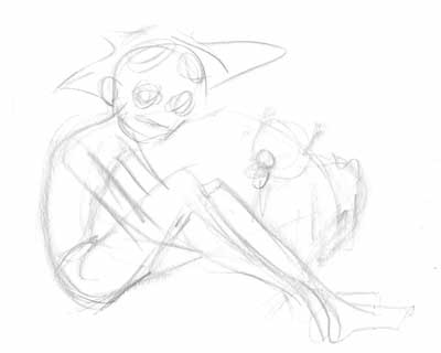 |
Step
1 |
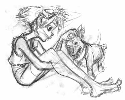 |
Step
2 |
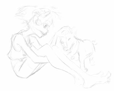 |
Step 3 I erase everything! I use a kneaded eraser and rub down the whole drawing. This knocks out a lot of the stray marks and works well if you're like me and tend to draw darkly in step 2. I keep erasing until no more will come off. It sounds scary but all the important information is still there - it's just lighter. |
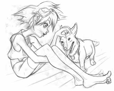 |
Step
4 |
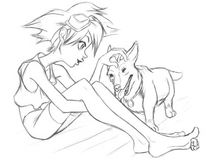 |
Step 5 Once the drawing is scanned, I use the "levels" in Photoshop adjust the image so that the background is white and my darkest lines are black. I use the "eraser tool" to clean up stray marks and my dirty, little fingerprints. Also, Ein's body was looking a little too small, so I selected his body with the "lasso tool" and used the transform to enlarge it. I'm ready to color the lines now. |
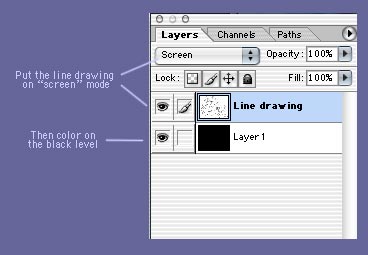 |
Step 6 Convert the image from Grayscale to RGB (or CMYK if that's your thing.) Then add another layer and make it solid black. Now change the layer composite for the line drawing from "normal" to "screen" (in some versions of photoshop you'll have to change to "overlay" for this to work. I don't know why). You'll color on the black level and it will show through to the line level. |
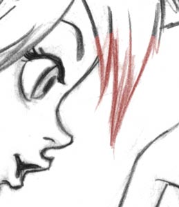 |
The lines
will become whatever color you paint with on the black level. I use a fairly
small brush so I can fine-tune what lines get each color. I like this method because it doesn't change the integrity of the linework. Dark lines stay dark. Light lines stay light. |
 |
If you "hide" the line drawing level, you'll see that the black level looks something like this. |
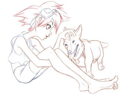 |
Step 6 When I've got all the lines the color I want them, I flatten the image. BOOM! I got a colored line drawing. Now I'm ready for the heavy duty coloring. |
 |
Step 7 For the background I borrowed from another illustrastion I did. I like to recycle, so I used the textured background from my Faye Valentine picture. |
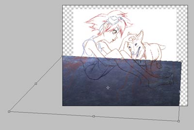 |
I set the line drawing layer to "multiply" so I can see through it. Then drag and drop the background image to a layer beneath it. Using the "distort tool" I stretch the textured image to match the perspective of the floor. |
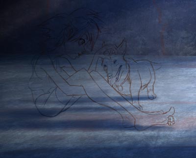 |
Next I copy the textured image again and use it for the back wall. With "Hue/Saturation" and Photoshop's other tools, I adjust the colors and the values. I decided to go a little more blue for this piece. Then I painted in the cast shadows for the figures. For now I'm done with the background. I'll do some fine-tuning in the final stages. |
 |
Step 8 With the colored line drawing set to "multiply" in the layers menu, I start coloring on a new layer placed beneath the line work. At this point, it's just like coloring in a coloring book. I'm just using a simple brush and trying my best to stay in the lines. |
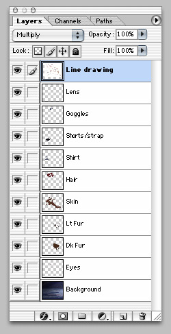 |
I put every different color on it's own layer. This way I can change each color individually if I need to without messing up the other colors. Many times I will change the hue or value or saturation of a color after I start painting if it seems like it's not working. Photoshop is flexible like that and I try to make the most of it. For example, if I needed to make her hair blue for some reason, I could do it just by adjusting a slider and it wouldn't change the color of her skin or clothes or anything else. |
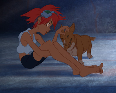 |
Now all
the basic colors are laid in. I'll make any final adjustments to harmonize
the colors if I need to. It sort of looks like a painted cel at this point. |
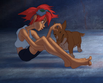 |
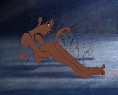
Step 9 I add the highlights. Like the base colors, each highlight color gets it's own layer. In this stage I also deepen some of the shadows and add reflected light. I like keeping all the lighting effects on separate layers because it allows me to change the light source (if needed) without having to change the base colors. |
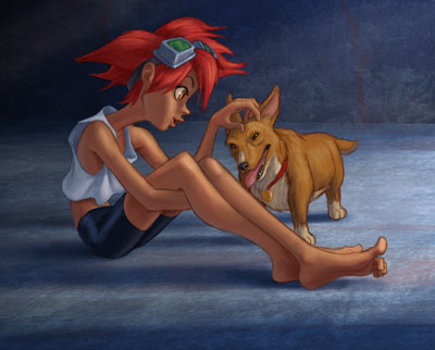 |
Step
10 Then I save it, put it on my website, and put it on my favorite message boards. The final piece looks like this. |
| ©Michael Greenholt All Rights Reserved Unless Otherwise Noted |